“Time flies when you are having fun,” – A very common saying that goes without fail in connection with Lightning Experience. Launched two short years ago, there have been several advancements and enhancements made. It also goes without saying that the Winter’18 Release, might witness some more new changes, to affect your components and Visualforce pages.
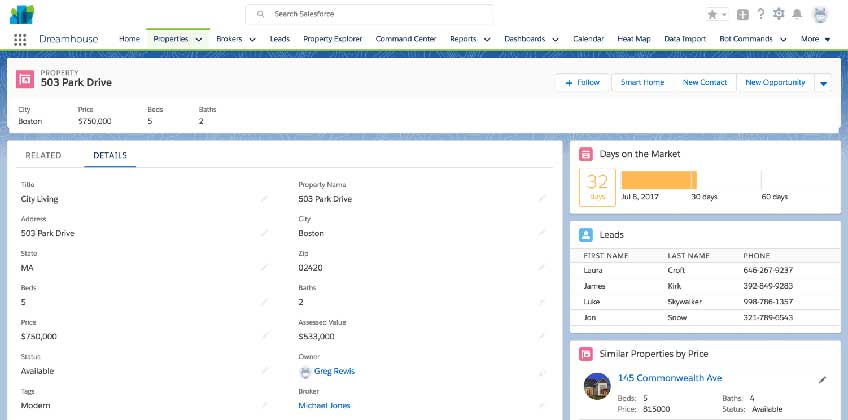
In addition to various new features, Lightning Experience has also introduced us to a new look and feel. This is based on the Salesforce Lightning Design System, containing a modern UI framework. It is also that for developers, the Salesforce Lightning Design System, or SLDS enables a blueprint for building on the Salesforce platform. The HTML and the CSS provided for by SLDS, ensures that all the components and applications have the similar look of the lightning experience. Winter ’18 is also said to add a background image and color to the entire Lightning Experience.
There has been an evolution in the look of the Lightning Experience with Winter’18. This is the result of the research from across the Salesforce Ecosystem. The global change has been made to improve:
- Legibility of pages
- Enhance content density
- Improve the contrast between the background and content cards
The Background Changes
The add on of a background color and image always means that the Admins and the Developers alike need to check on the custom Lightning components. This also includes all the components that have been downloaded from the AppExchange. The Components which are indeed being used on a Lightning page is required to have a good background to remain legible on the new background.
The List Density
You will also notice at some point that in Winter ’18, they have increased the density. Hence, allowing you to view some more data in the same space.
Once again, if you are at the same time using SLDS markup and CSS, it can be noticed that you will automatically get the increased density within your components.
The Page Legibility
Apart from an increased density of lists, there is also some presence of subtle differences in typography. We have indeed increased the size of the font that is used to display data to more easily allow the users to scan through various things like the record detail layouts.
If you have overridden the standard styling of fonts in your components or even in the Visualforce pages, you will want to ensure that the larger font does not negatively impact the layout of your component or page.
The Static Resources
Lightning components as well as the Visualforce pages that have been built with static resource version of SLDS, and could potentially look out of place now, since these static versions of SLDS will not get the updated designs to SLDS. If possible, all these components and pages should be updated to use the present version of SLDS instead of the static resource.


